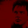
Step 1
Open a new file with the size 100x100, then put your image on there and crop
the picture however you like.
Step 2
Desaturate the image via Image >> Adjustments >> Desaturate
Step 3
Create a new layer on top of your desaturaetd image and fill it with a dark
red color (#5F0000 or #7F0000).

Then set the layer to Multiply

Looks okay already and if you want, you can now just add borders/brushes/text to it and you're finished. But I think it's a bit dark, so I'm working some more on it.
Step 4
Here's a bit more finetuning. There are two different methods for this I usually
use.
a.)
I'm adjusting the brightness and contrast to bring out the details of the image
underneath a bit better. Go to Image >> Adjustments >>Brightness/Contrast
and my settings were brightness: +14 and contrast:
+40, settings for brightness and contrast can vary a bit depending
on the image you have.

b.)
For the other method you can work with adjusting the curves. To do so, go to
Image >> Adjustments >> Curves. I've put the settings on
Channel: RGB, input: 77, output: 80. As with the method above,
the exact settings can depend on the image, you might have to use more or need
less input/output for getting the image shown better.
It looks slightly different than with the brightness/contrast adjustment. In
the end, which look you'll prefer is up to you.
Step 5
And now all that's left for you is to add brushes/borders/text to put the finishing
touches on the icon.
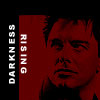
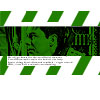
The tutorial also works with dark green (#217F00) and dark blue (00487F), for both I've used method 4a. The image used for the tutorial is from Torchwood.de